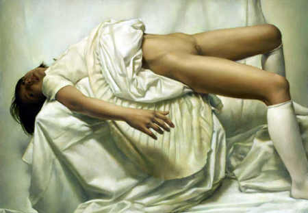
Balthus is one of my all-time favorite painters. Because of certain American sensibilities, his work tends to cycle between "unknown" and "repugnant" in the popular psyche; even so, many people appreciate him: the author Thomas Harris made his Hannibal Lecter character a relative of Balthus, and there are some contemporary artists (such as Naoto Kawahara) who are quoting from his work.
The Museum of Modern Art has several of Balthus's great paintings in their collection: Joan Miro and his Daughter Dolores, Portrait of Andre Derain, and The Living Room. Unfortunately for a Balthus fan like myself, these haven't been on view in a very long time. However, one painting from their collection has recently seen the light of day: one of Balthus's masterpieces, The Street, is currently on view by the 5th floor restaurant.
The Street is a large painting with a lot going on. It's one of Balthus's most famous and scandalous works - it may not seem particularly offensive today, but the sexual assault taking place in the bottom-left corner raised many eyebrows back in the 1930's, and the artist touched up the painting in the mid-50's, moving the boy's hand away from the girl's groin.
Anyway, if the emergence of this painting is any indication, maybe some of the museum's other Balthus paintings will come out of hiding. This is the first Balthus to be on view at MoMA since I moved to the city. Seriously, you guys: you can have more than one out at a time, you know.
Monday, February 8, 2010

Sunday, February 7, 2010
Oliver Arms at Ameringer McEnery and Yohe
First, a confession - I'm not much of a fan of contemporary abstraction. I like many abstract paintings (pieces by Motherwell, Georges Mathieu, Philip Guston, et cetera), but at the same time I am able to view the pieces in a historical setting rather than within the realm of contemporary discourse. I feel that contemporary art, with an emphasis on concept and irony, has pushed abstraction to the side in favor of more "brainy" work. That said, I recently saw a show that renewed my faith in contemporary abstraction: Oliver Arms at Ameringer McEnery and Yohe.
Ameringer McEnery and Yohe is a gallery on 22nd that mainly shows dead or dying modern artists. They have some big names (Calder, Frank Stella, Motherwell, Pollock) in their inventory, and they have a few living artists who show there as well. The last show I saw there, of figurative paintings by west coast painter Rebecca Campbell, I found to be pretty underwhelming. While I usually gravitate towards figurative work, I found Campbell's paintings to lack any kind of staying power. It's usually a bad sign when I have to go to a gallery's website to remind myself of what the paintings looked like, but that's what I had to do with Campbell's show. It wasn't a terrible show, just not a memorable one.
After that experience, I wasn't particularly optimistic about the gallery's following contemporary exhibition - Oliver Arms. Arms is, like Campbell, a west coast painter, but his work is completely abstract. Given my general distaste for contemporary abstraction, I wasn't expecting much, but I decided to check out the show anyway.
Arms's paintings presented themselves to me as mysteries: they are very difficult to describe, which is probably a good thing. The closest comparison I can make is to crinkled-up marbled paper, but even that falls short of accurately describing the paintings. The images on the gallery's website do the paintings no justice - the JPEGs are far too small and there are no up-close details to be seen.
Not only are Arms's paintings difficult to describe, they're also difficult to deconstruct technically. There are no visible brushstrokes, yet they are oil on canvas. I fancy myself to have a decent knowledge of oil painting techniques, and it took me a while to figure out how he got the effects he did. It turns out that the paintings are sanded; my hunch was confirmed by the gallery's press release. Arms builds up layers of paint and sands them down, creating concentric rings of color and different textures across the canvas.
Another painter who is known to sand his work is Odd Nerdrum. I don't care for most of his large multi-figure compositions (they look stiff, posed, and like he's trying too hard to be surreal) but his smaller pieces can be excellent. One of the techniques used by Nerdrum is sanding - he's known to glaze shadows over his figures and sand off parts of it to break up the brushstrokes and create a hazy atmosphere. One enterprising individual claims to have deconstructed Nerdrum's technique and is trying to sell it, against the artist's wishes I imagine. How one can sell "sand your paintings" for $19.95 is beyond me, though...
Sanding isn't a widely-used technique in oil painting, probably because it can kill you. Many popular oil colors contain lead and cadmium, heavy metals that can easily enter your body when their dust is inhaled, potentially causing nerve damage, poisoning, and cancer. For example, according to the company's MSDS, most Winsor and Newton whites contain some amount of lead. Winsor and Newton is a very popular brand, and white is probably the most used color in oil painting, so sanding a painting can be risky. It even says right on the tubes not to sand cadmium-based paints because of the risk of lung cancer.
While Nerdrum is thought to only sand parts of his paintings (and I'm not paying $20 to find out for sure), Arms seems to sand the entire thing. I imagine he must use a power sander - sanding a 72x72 inch canvas by hand would be a painful ordeal. Whatever his method may be, the results are astounding. It's the kind of art that shows the failings of language - there's not really much to say about it. I'm at a loss for words, even more so than usual when trying to talk about abstract art. My inability to criticize this show in a sophisticated manner shouldn't be held against it, though. Silence is golden, and for work like this, the less that has to be said, the better.
Friday, February 5, 2010
Les Rogers at Leo Koenig
So, for the past week or so I've had a nasty cold, my second one of the season (not as severe as the case of the flu I had in October, which had me laid out for two weeks). After a week spent lying in bed drinking ginger ale and eating cough drops by the bag, I was ready to finally get back on my feet and into some galleries. I had an hour and a half to kill before meeting some friends in Flatiron, so I decided to check out what's new in Chelsea. I saw a couple shows that were worth mentioning, and over the next few days I'll get to writing about them, but first I'd like to talk about one show that particularly stood out in my mind.
Leo Koenig Inc. is a gallery on 23rd Street that I went to quite often when I worked for a framer on 11th Ave. I would go to Brownstein's (RIP) for lunch, since they were the closest restaurant to the frame shop, and spend the rest of my break eating picnic salad and going into the galleries on 23rd, Leo Koenig being one of them. Since that time, the gallery has expanded - there's the main space, and next door is Leo Koenig Projekte, a smaller space that follows the recent trend of galleries setting aside small spaces to experiment with new artists without devoting their entire gallery to them. The group show (curated by one of the gallery's artists) in the project space didn't do much for me, but Les Rogers's solo show in the main gallery exceeded my expectations.
Practically all of the paintings in the show were massive - the canvases wouldn't fit on any of the walls in my apartment... if they could even get up the stairs and in the door. The large "white cube" spaces in most galleries (including Leo Koenig) tend to shrink work, but Rogers's paintings stay massive. Each painting is a mix of representation and abstraction that takes a while to sort out visually and mentally. One painting in particular, "Tall Vanity," is particularly bewildering. Sure, a lot of detail is lost when looking at a five inch JPEG of an eight-foot-tall painting, but even up close in the gallery I had no idea what was going on.
That's what I like about the paintings in this show - they exist in the ambiguous space between representation and abstraction, motion and stillness, memory and fact. The palette itself is dark and mysterious (for the most part) with hints of vibrant color.
Looking back on things, I believe the reason I was so drawn to this show is its similarity to some of the Romanian Painters I've been looking at recently. His palette and color usage are similar to that of Adrian Ghenie, and the themes of memory, confusion, and amnesia remind me of Sergiu Toma's work. At the same time, though, Rogers is also tapping into American art history - his canvases are massive and the surfaces hint at the influence of DeKooning. The paintings definitely have passages of high abstraction, and the paintings' apparent grounding in "real" space makes these passages all the more mysterious. In a few of the paintings, there are jumbles of stuff that remind me of the debris left over from a disaster - a fire, a flood, or a nasty storm. Having lived through a few such events, I know the feeling of seeing a destroyed place and knowing that it will never again resemble the place in my memories.
UPDATE: To all Metal Gear fans: there's a clothing store on Broadway and 25th in Flatiron called "Big Boss Enterprises." The kicker: all the clothes are laid out on top of cardboard boxes in the center of the store. Was this intentional? I don't know, but it is awesome!
Saturday, January 23, 2010
Zhang Huan at PaceWildenstein
Remember back in 2008, when Chinese art was the biggest thing going? Maybe it had something to do with the Beijing Olympics, but China-mania swept the art world up until the recession hit that September. Several major galleries opened spaces in Shanghai, and it seemed like anyone with a Chinese-sounding name could walk into a gallery and get a show booked. Prior to the art world's brief obsession with China, there were only a few internationally famous Chinese artists, such as Cai Guo-Qiang and his gunpowder paintings, and Zhang Huan and his highly varied output of performance pieces, sculptures, paintings, and prints. His solo show at PaceWildenstein's 22nd Street space, titled "Neither Coming Nor Going," shows a recent sculpture and some prints, but honestly, it could have just been the sculpture.
The obvious highlight of the show was a twenty-foot tall sculpture of the Buddha made almost entirely out of incense ash (with a few red incense wrappers and some bones stuck in it too). It's so monumental that it even overwhelms the gallery's massive exhibition space. One of the statue's hands has fallen off and sits on the ground next to its legs. According to the gallery's website, smoke is supposed to come out of the statue's head, but I never witnessed this.
Here's what I could find on the meaning behind the statue: its name, Rulai, is a Chinese translation of the pronoun the Buddha used to refer to himself after reaching Enlightenment: Tathagata. Tathagata is used to mean "beyond coming and going" because it has two meanings depending on slight variations in its pronunciation: it can mean "one who has come" or "one who has gone." Being neither coming nor going means being outside of the eternal cycle of death and rebirth - in Buddhist thought, Nirvana. (Source)
The statue of the Buddha is made out of incense ash - it's made out of the residue left behind from prayers and wishes. There are even incense wrappers embedded in the statue. One potential interpretation of the work might be that even though the Buddha reached Nirvana, humans keep bringing him back through rituals and prayers. To put it in a western perspective, maybe God is the end, not the beginning, and perhaps mankind is contributing to the construction of the divine with every prayer said, every incense stick lit, every life lived. Or, maybe you could just listen to the artist and his explanation of the work and its relationship to the economic situation in China. As I said before, I prefer to look at work by myself without the artist's intentions looking over my shoulder.
There were some woodblock prints and stuff, but seriously: GIANT ASH BUDDHA! Awesome.
An Aside: Art Magazines
This little tangent started as part of my post about Adrian Ghenie and Romanian artists, and took on a life of its own. In the original post I mentioned that I have way too many art magazines. Every month I read the "big three": Artforum, Art in America, and ArtNews. I also read Flash Art and Modern Painters and some of the quarterly publications dealing with regional art scenes, such as Art Lies and Art Ltd.
Artforum is probably the biggest art magazine right now - it has some of the best critics out there writing for it, and all varieties of art are covered - film, installation, painting, sculpture, conceptual, you name it. Sometimes they're a bit heavy on film coverage at the expense of other media, but that's a minor complaint about a solid magazine. It's supposed to have an international view, but half of the reviews are of New York shows. It does review shows from overseas, but usually just one or two per country in each issue. Speaking of being "the biggest art magazine" and "solid," issues of Artforum tend to be really thick (like Vogue, its bulk is mostly ads, but ads can be a good way to find out about exhibitions). Also, it's like a big square, which is cool since it sticks out past the other magazines on the bookshelf.
Art in America is kind of stuck in the middle between Artforum and Art News. Last year they had a series of opinion articles written by Dave Hickey, which were great reads, but his contract seems to have expired or something by now. Art in America is one magazine I don't really have an opinion about - I read it, but nothing really strikes me as being either excellent or horrible. Recently they raised their price to $9 an issue, which is just a dollar less than Artforum. If I had to choose, I'd pay an extra dollar and get double the magazine.
I keep all my issues of ArtNews in a basket in my bathroom. Why? In case I run out of toilet paper. In all seriousness, ArtNews isn't a total asswipe, but it's definitely the bottom rung of art magazines. The articles remind me more of Time and Newsweek than Artforum or Art in America - they seem over-generalized and written for people who don't know anything about art. I suppose it would be a good entry-level magazine for those new to the art world, and they occasionally have interesting articles, but it's really more of a news magazine than an art magazine. Their reviews are a waste of time - they never really say anything, and they tend to cover galleries from art scenes that nobody really cares about (Key West, for example).
Flash Art is supposed to have a global view of the art world, but it mainly covers Continental Europe. I've found Artforum's European coverage to be spotty, so having a whole other magazine devoted to it is nice, especially since there are some excellent artists who are big in Europe but nigh unknown in the states. The big problem with Flash Art has been finding it. The vast majority of newsstands don't carry it, and a subscription winds up costing about $20 an issue. I found one newsstand that had it, in Grand Central, but it closed down. There's another one on 42nd Street near Port Authority that sometimes has it, but they mark it up to $16 an issue, which is insane. I've occasionally seen it in St. Mark's Books, but again, not reliably. After I moved to Williamsburg this past September, though, I finally found my source: Spoonbill and Sugartown, an awesome bookstore on Bedford Ave that will probably be the subject of another post. They actually get Flash Art regularly, which seems to be a rarity. Interestingly enough, last March, I went to the Flash Art booth at the Armory Show and talked to the representative about my trouble finding the magazine - she said that they were having distribution problems, which was kind of an understatement. By the time I got there they were sold out of the current issue and all their back issues, so I guess a lot of other people have been searching for the magazine as well.
Modern Painters is a slim volume but it tends to be a good read. Despite the name, some issues contain little or no mention of painting. Like Art in America, I read it but nothing particularly strikes me most of the time. One thing about it that does stand out is the magazine itself - it's too tall to fit on any of my bookshelves, so I have to put it on its spine, which makes it jut out past the Artforums.
I also occasionally read smaller circulation magazines that deal with local art scenes. Art Ltd. covers the West Coast, but it's not all hip LA art: there's also the photorealist galleries of Santa Barbara and the terribly corny stuff coming out of Santa Fe. Art Papers has in-depth criticism, good interviews, and some excellent writing, but their focus is oriented towards installation/conceptual art, (granted, I've missed a few issues, so this might not be an accurate statement) which I appreciate, but as a painter, I'd like to read about stuff on the walls sometimes. Art Lies covers Texas, but not cowboy art - there's actually some cutting-edge stuff coming from there, which makes it an excellent read as well.
So, overall, I read a lot of magazines. I don't throw them out, either - they can be an excellent resource for looking up artists or just for inspiration in the studio... or "inspiration" in the bathroom.
Friday, January 22, 2010
Romanian Painters: Coincidence?
I'm not sure why, but lately I've been seeing Adrian Ghenie's work everywhere. Not "opium-and-shrooms-at-the-same-time-get-kicked-out-of-college-for-hallucinating-about-your-stat-teacher" everywhere - I'm talking about the major art magazines. The most recent Flash Art has a Ghenie piece on the cover and an interview inside. The most recent Artforum has an ad for a Ghenie show at Mihai Nicodim in LA (Maybe my little sister, who lives in LA, would be interested in seeing the show and reporting back about it. Hint, hint, kiddo.). And I remember seeing several more references to him in the half-dozen or so magazines I read each month, but I have so many goddamn magazines in my apartment and studio that trying to find one particular review would be a full-time job.
At any rate, you could say that I dream of Ghenie. It's no surprise - in his work, I see many things I'd like my own work to be. His paintings maintain a delicate balance of order and chaos - everything seems rational even though it's been scraped with a trowel and repainted a dozen times. His color palette frequently switches between monochrome and vibrant and it works either way. At least on a formal level, I look at Ghenie's work with envy.
One series of paintings, "The Collector," shows the infamous Nazi looter Hermann Goering looking at his collection of stolen artwork. Another series is called "Pie Fight" and depicts serious-looking suited men throwing pies at each other (like the famous deleted ending from Dr. Strangelove). Other uplifting themes in Ghenie's oeuvre include Lenin's corpse, wolves coming out of the darkness, and seemingly silent scenes of interiors cloaked in shadows. Also, roadside executions.
Ghenie's work also ties in nicely to an exhibition I saw last night. I had been in Chelsea working with a friend on some changes to his website, and once we were done I decided, since it was Thursday, to try and score some free wine at gallery openings. I peeked in a few galleries but didn't see anything amazing until, on 25th street, something caught my eye - a cat.
A brief aside: my little sister, who lives out in LA, loves cats. A lot. Like, way more than most people. She and her fiancee have two of them, and her neighbors (who are practically part of the family) have six. Anyway, here in Williamsburg, there are a lot of cats. Most convenience stores have at least one on the payroll as a mousetrap. Recently, I started taking pictures for her of all the neighborhood cats that I could track down. I saw the cat in Chelsea as an extension of this little project, so I went into the building to snap a few pictures of the little guy.
 The little bastard who started it all...
After I had finished photographing the cat, I looked up and noticed some wine bottles on a table down the hall. Finally, an actual opening reception! I followed the smell of cheap wine to a small gallery, called "Slag", hidden in a back hallway. The gallery was, indeed, having an opening for a group show that had just gone up that day. It just so happens that one of the four artists in the show is, like Ghenie, also Romanian.
I don't want to make hasty assumptions, but if these two are any indication, then damn, there's some good art coming out of Romania these days!
The Romanian artist in the group show "Realm" at Slag Gallery is named Sergiu Toma. One wall of the gallery was devoted to his work. Like his countryman Ghenie, Toma's work is mainly monochromatic with touches of color. The childlike figures look like they were taken from old photographs, but the faces are all blurred or otherwise distorted, like curse victims in The Ring. The nostalgic colors and subjects coupled with the fuzzy rendering brought to mind themes of forgetfulness - forgetting the faces of lost friends from long ago. One large painting, called "Time Machine," had a boy peering into a strange green machine that appeared to be a combination water cooler/drill press. Like the other paintings, the coloration was bleak, save for the viridian green machine. A smaller version, without the boy, was also in the show. I know there have been many times in my life when I wish I had a time machine, or at least the ability to go into a coma at will to sleep through stressful situations.
The forgetfulness that accompanies the endless march of time... and the fact that there are many situations in our lives we would like to forget. Given some of the settings in which Toma placed his characters, I imagine there are things they would like to forget as well.
UPDATE 1/27: Here's another excellent Romanian painter I found. I'm seeing Romanian painters everywhere... someone call Health Services, I think I just saw Szabolcs Veres on my toast!
At any rate, you could say that I dream of Ghenie. It's no surprise - in his work, I see many things I'd like my own work to be. His paintings maintain a delicate balance of order and chaos - everything seems rational even though it's been scraped with a trowel and repainted a dozen times. His color palette frequently switches between monochrome and vibrant and it works either way. At least on a formal level, I look at Ghenie's work with envy.
One series of paintings, "The Collector," shows the infamous Nazi looter Hermann Goering looking at his collection of stolen artwork. Another series is called "Pie Fight" and depicts serious-looking suited men throwing pies at each other (like the famous deleted ending from Dr. Strangelove). Other uplifting themes in Ghenie's oeuvre include Lenin's corpse, wolves coming out of the darkness, and seemingly silent scenes of interiors cloaked in shadows. Also, roadside executions.
Ghenie's work also ties in nicely to an exhibition I saw last night. I had been in Chelsea working with a friend on some changes to his website, and once we were done I decided, since it was Thursday, to try and score some free wine at gallery openings. I peeked in a few galleries but didn't see anything amazing until, on 25th street, something caught my eye - a cat.
A brief aside: my little sister, who lives out in LA, loves cats. A lot. Like, way more than most people. She and her fiancee have two of them, and her neighbors (who are practically part of the family) have six. Anyway, here in Williamsburg, there are a lot of cats. Most convenience stores have at least one on the payroll as a mousetrap. Recently, I started taking pictures for her of all the neighborhood cats that I could track down. I saw the cat in Chelsea as an extension of this little project, so I went into the building to snap a few pictures of the little guy.
 The little bastard who started it all...
I don't want to make hasty assumptions, but if these two are any indication, then damn, there's some good art coming out of Romania these days!
The Romanian artist in the group show "Realm" at Slag Gallery is named Sergiu Toma. One wall of the gallery was devoted to his work. Like his countryman Ghenie, Toma's work is mainly monochromatic with touches of color. The childlike figures look like they were taken from old photographs, but the faces are all blurred or otherwise distorted, like curse victims in The Ring. The nostalgic colors and subjects coupled with the fuzzy rendering brought to mind themes of forgetfulness - forgetting the faces of lost friends from long ago. One large painting, called "Time Machine," had a boy peering into a strange green machine that appeared to be a combination water cooler/drill press. Like the other paintings, the coloration was bleak, save for the viridian green machine. A smaller version, without the boy, was also in the show. I know there have been many times in my life when I wish I had a time machine, or at least the ability to go into a coma at will to sleep through stressful situations.
The forgetfulness that accompanies the endless march of time... and the fact that there are many situations in our lives we would like to forget. Given some of the settings in which Toma placed his characters, I imagine there are things they would like to forget as well.
UPDATE 1/27: Here's another excellent Romanian painter I found. I'm seeing Romanian painters everywhere... someone call Health Services, I think I just saw Szabolcs Veres on my toast!
Thursday, January 21, 2010
Chautauqua: A Continuum of Creativity at Denise Bibro
First, a disclaimer: I'm not a fan of the kind of work usually shown at Denise Bibro. It's a gallery that shows C-grade artists who are smart enough to stay away from the vanity galleries, but their work isn't contemporary enough to be noticed by any of the more respected cutting-edge spaces. The work in question is the sort of work that isn't self aware - it's work that seems to be done for its own sake, which was a justification that worked back in the days of modernism and before but doesn't quite fly today. It's work that doesn't connect to art history, or to contemporary discourse, or to anything outside of the canvas. That said, I'm not going to deny that there's a market for this sort of work, and I'm not trying to disrespect the artists who show at the gallery - I'm just trying to make known my expectations going into this show. Also, on my way to the opening the elevator I was in almost crashed and I had to help pull people out of the stuck car, but that's another story.
The only reason I went to this show is because a friend of mine had a piece in it. The show itself was divided into two rooms: one room had work by the faculty of the Chautauqua school, and the other room had work by the school's alumni (including my friend). Most of the work in the student room was, to put it politely, assballs. A few pieces stood out as being decent: my friend's piece (and I'm not just saying that to be nice; it would have been one of my favorite pieces even if I didn't know it was his), a two-panel oil, latex, and ink on paper painting of highly stylized islands, was one of the best pieces in the show. It's the kind of painting that's really hard to describe, so here is a link to a whole page of them (the one in the show is "Island Series 1".)
Another piece that stood out was a large Rococo-style porcelain sculpture, "Paradise" by Chris Antemann. It had a degree of finish and Jeff Koons-like professionalism that seemed out of place next to awkward student paintings and toilet-brush sculptures. It's one of the better pieces in the show - the gallery is using it on all the promotional materials. Surprisingly, it was done by an alumnus, not a professor.
Few of the professors' pieces really stood out to me - one memorable piece was "Premise" by Don Kimes: a large photograph printed on canvas of what might have been a microscope slide or maybe someone licking a camera lens. Whatever it was, it was (to me) the strongest piece among the teachers' work. Another piece that caught my eye looked like intestines or maybe saucy spaghetti ("Plot" by Tom Butter). There was a lot of predictable and average work (an academic nude, some geometric abstraction, a couple portraits) and then there was one piece that looked like it came straight from my grandma's living room. This sort of work is the norm at Denise Bibro, and not surprisingly the artist actually shows at the gallery; I imagine that she had a hand in getting this show set up. If she did, I'm thankful, because my friend has another notch on his resume and I had a chance to conquer my long-running phobia of dying in an elevator crash.
Subscribe to:
Posts (Atom)


 Posts